How to set HTML height to full screen
Updated:
Note I’m using TailwindCSS - a utility-first framework. If you’re not familiar with TailwindCSS, please ignore the syntax. I will mainly explain the problem that I have and how I solve it in CSS.
While working on a dashboard, I want to make it fun and funky for users so I design a signup page like an image below. Left side is a purple background with an illustration on top, the right side is a signup form for users.

The problem
However, I’m faced with the problem that the purple background on the left doesn’t stretch the whole screen height, like in the image below.
If you’re working on a white background or one colour background, the problem wouldn’t be so obvious. Because I want to have two colour background, the problem shows like the image below.

Using Chrome dev tool (for mac, Option + Command + I) to inspect elements, I found that HTML and Body elements are as high as the elements within it. The image below shows the blue area where the content within the body area covers, which is not a full screen.
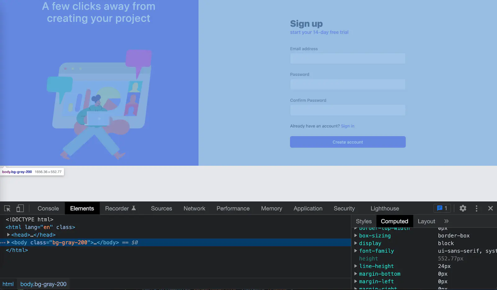
Note that Chrome browser has default styling for Body element like this.
body {
    display: block;
    margin: 8px;
}
TailwindCSS reset the styling to reduce browser inconsistency by removing all of the default margins from elements like headings, blockquotes, paragraphs. More details on an opinionated set of base styles in Tailwind. That’s why in this example we don’t see Chrome’s default styling.
First attempt
I tried to set body to height 100% like this.
body {
    height: 100%;
}
Which is equivalent to h-full class in TailwindCSS.
It still doesn’t fill the height of a whole page as you can see in the blue area in the image below. The pink box is just to show that I added height 100% to the Body element.
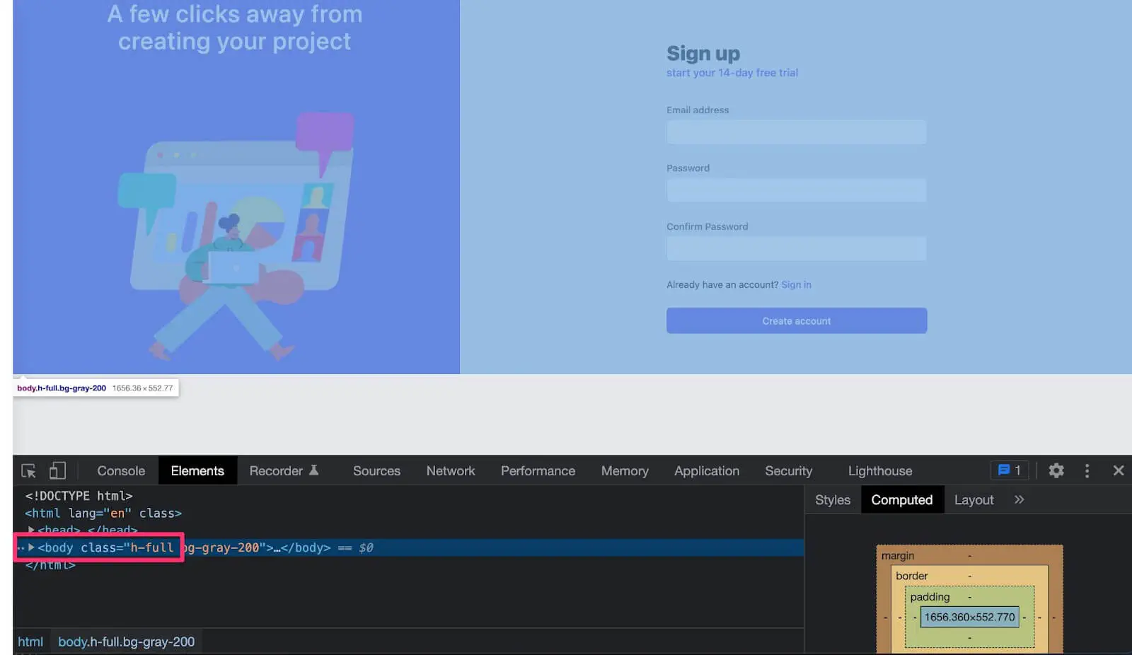
Why doesn’t it work?
When using a percentage, child elements inherit value from the parent elements. HTML element is a parent of Body element, whose value isn’t set. When the parent element doesn’t have any value set, the child element (in this case, Body element) doesn’t know where to get the value from.
Let’s add height to the html element.
html {
    height: 100%;
}

body {
    height: 100%;
}
And the result is :backhand_index_pointing_down:.
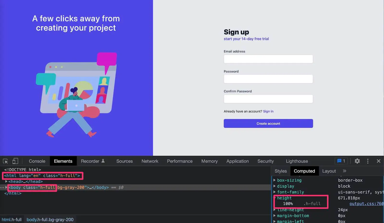
It works!
Now the purple background stretched to a full screen height. I make pink boxes
showing that both HTML and body elements now have height 100%, or h-full class in
TailwindCSS.
Why does this work?
Because now the Body element inherits 100% height of its parent (html) and html element has 100% height of its parent, which is the viewport. (Viewport is the area where the web page is in the browser window. This excludes the browser’s address bar and toolbar.)
That seems to work fine, until I add more text on the screen that overflows the page like this.

This is because when we set html and body elements to height 100%, it stays 100% to the viewport and does not allow content to grow.
There are 2 ways to fix an element that doesn’t strech full screen.
First way
Add min-height 100% to the body element
html {
    height: 100%;
}

body {
    min-height: 100%;
}
Note that min-height: 100% in TailwindCSS is min-h-full class.
This means the html element stays 100% to the viewport. Adding min-height: 100% to the body element means if the content within the body grows more than the viewport, the browser will allow the content to grow naturally to prevent overflow.
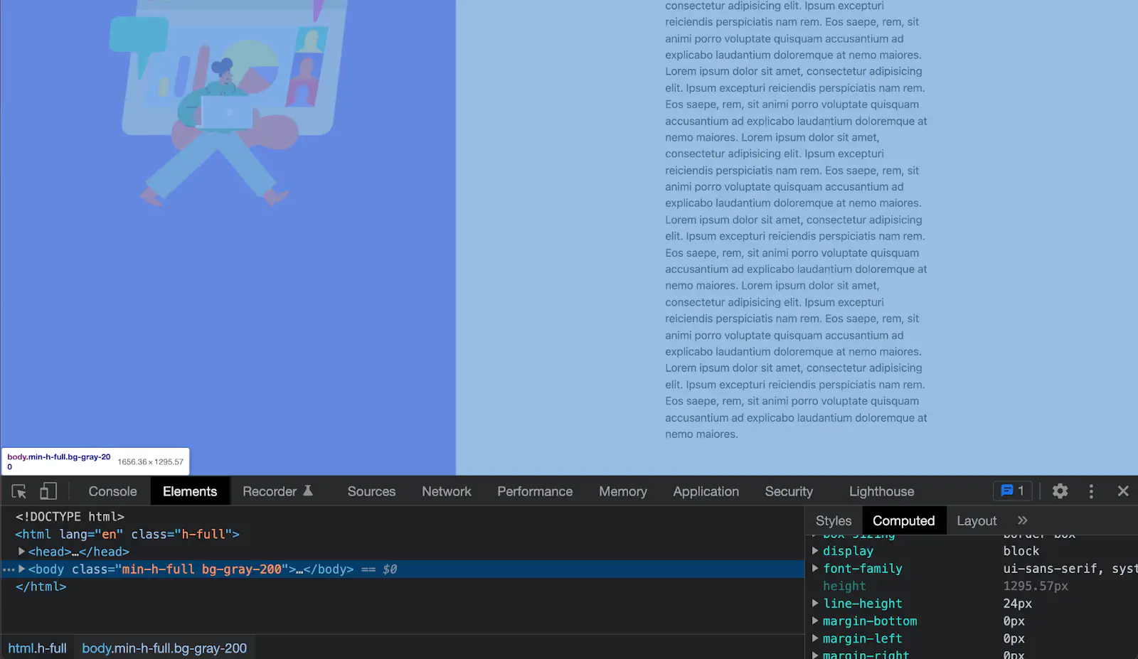
The image below shows that the html element stays static 100% to the viewport as shown in the blue area.
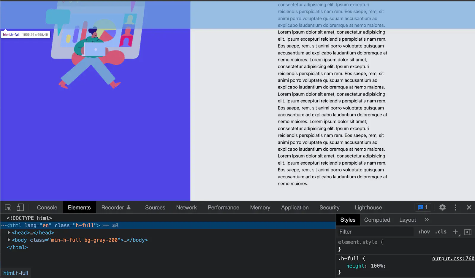
When I inspect the body element, I can see that the blue area covers the full screen and the purple background is as high as the overflow text on the right hand side.
Second way
Remove height from the html element and add min-height: 100vh to the body element.
html: {
    /* Remove height from html */
}

body: {
    min-height: 100vh;fasdfasdfasdfasdfasf
}
Vh is a viewport height which is a relative length unit. This ensures that the content within the body element fills the viewport.
Both ways will give the result of having the purple background stretches full screen like a result below.
