Flex Item Expanded Beyond Flex Container
Updated:
When I created an online live code editor (there will be another post about that), it consisted of
<textarea> and <iframe>, where text areas are for users typing the HTML and CSS while <iframe>
is showing the live output. HTML and CSS boxes are stacked on top of each other, taking up half of the screen on the left, and output takes up another half of the screen on the right.
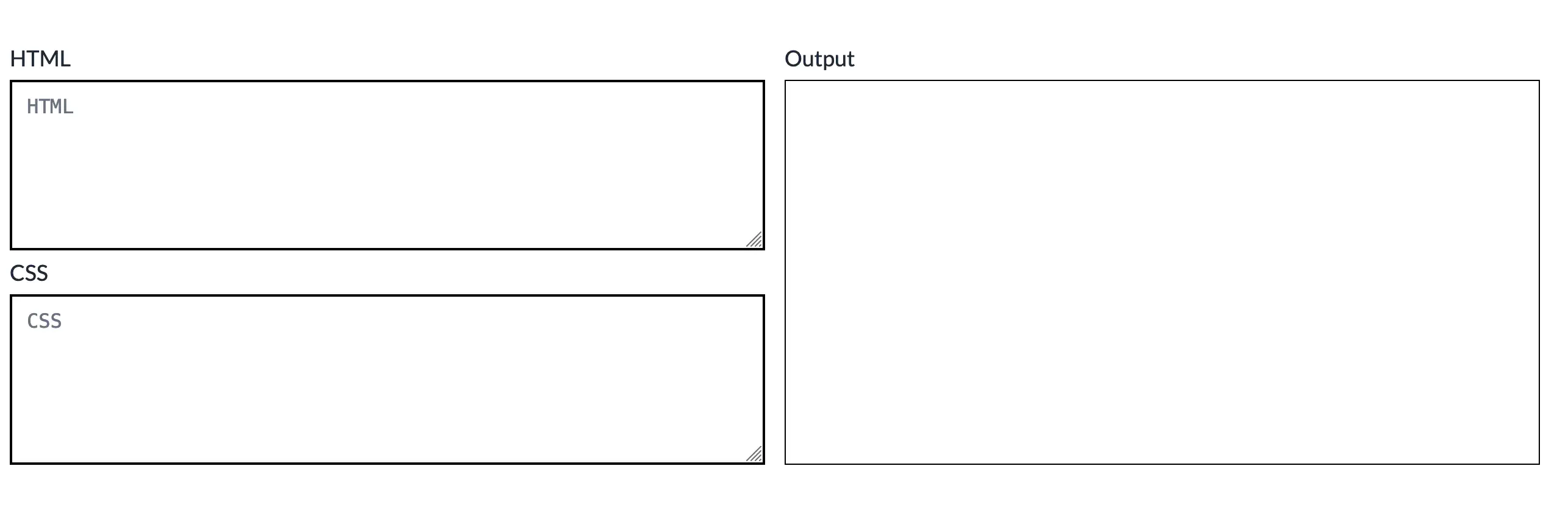
I want it to look like the image below.
Problem
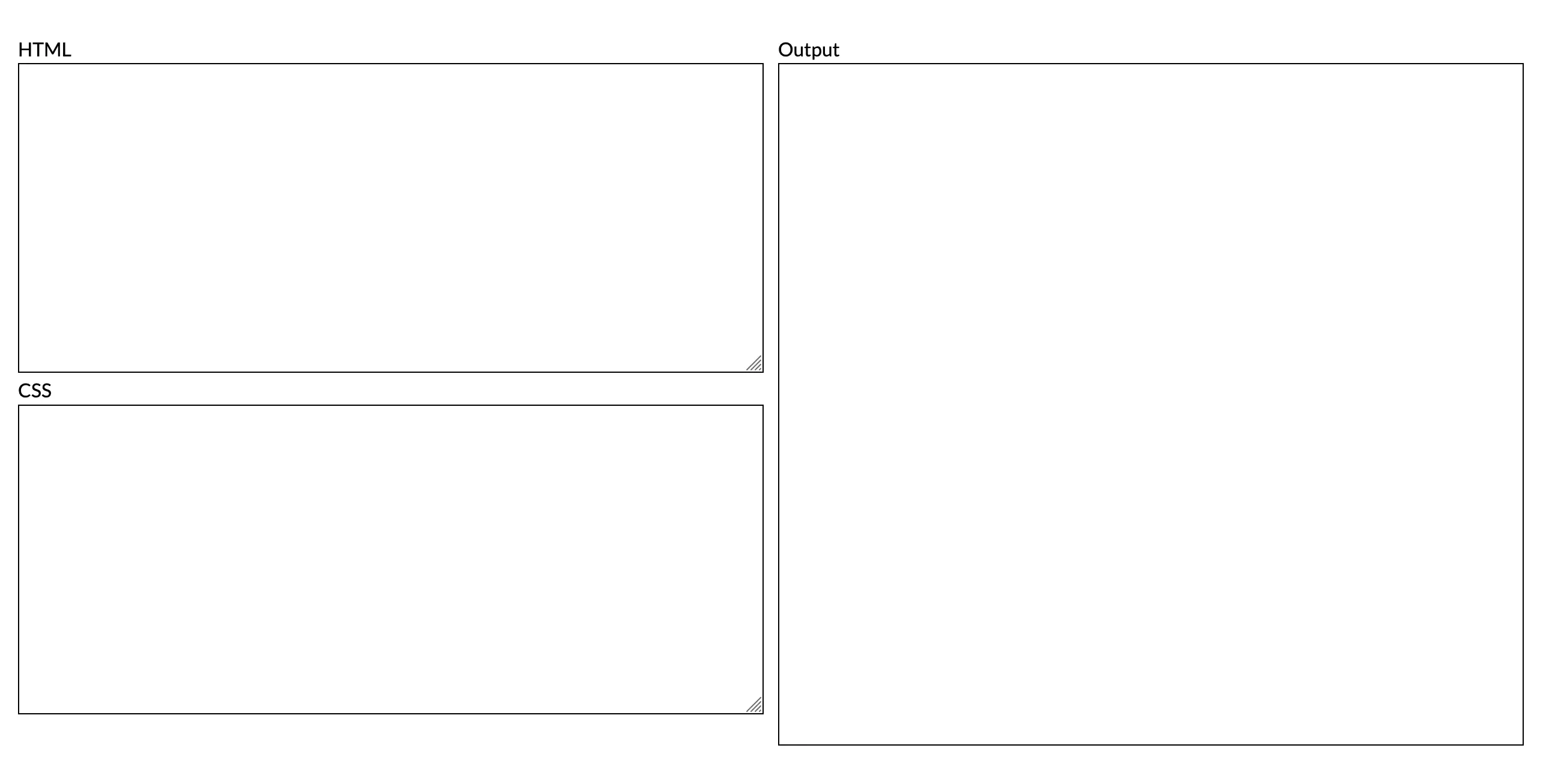
But it first looks like the image below. The output box on the right seems to extend longer than the code boxes on the left.
Here is my initial structure.
<div class="flex-container">
    <div class="code-block">
        <label for="html">HTML</label>
        <textarea rows="10"></textarea>


        <label for="html">CSS</label>
        <textarea rows="10"></textarea>
    </div>

    <div class="output">
        <label for="output">Output</label>
        <div class="frame">
            <iframe></iframe>
        </div>
    </div>
</div>
.flex-container {
    display: flex;
    gap: 1rem;
}

.code-block {
    height: 100%;
    width: 100%;
}

.output {
    width: 100%;
}

label {
    display: block
}

textarea {
    width: 100%;
    border: 1px black solid;
}

.frame {
    border: 1px black solid;
    height: 100%;
}
This structure resulted in the output box on the right expanding beyond the flex container, as you can see using the Devtool to inspect the element. The purple box is where the flex container is.
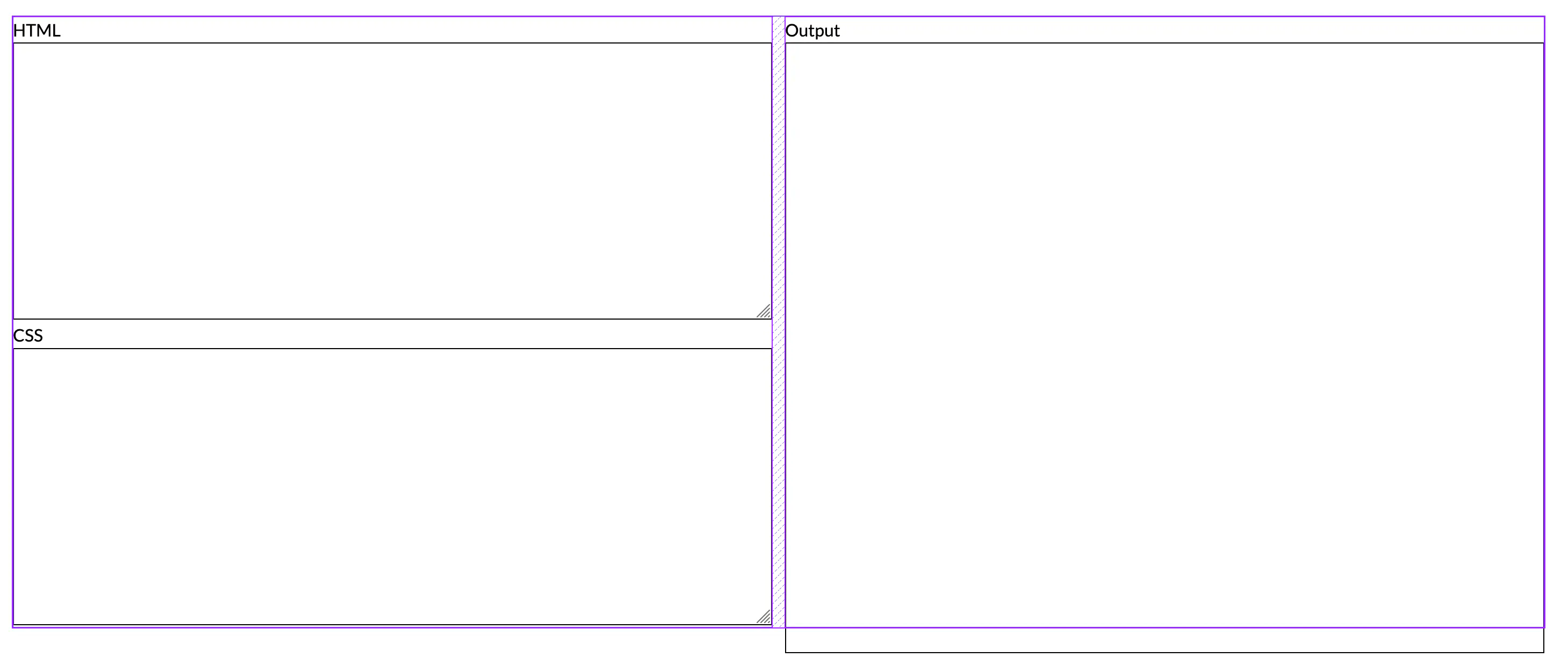
We learn that flex items should be the same height but why is one longer than the other?
If we carefully look at the HTML structure, <div class="flex-container"> is a flex container and
its children are flex items, which are <div class="code-block"> and <div class="output">.
This matches what the devtool shows us in a purple box.
The iframe is nested inside the <div class="frame"> and <div class="output"> where <div class="output">
is a flex item but its descendant isn’t. Therefore, the rule of equal height of flex items doesn’t
apply to the <iframe>.
Solution
- Flatten HTML structure
We have to change the HTML structure by removing <div class="frame"> and
adding CSS class frame on the iframe element instead.
<div class="output">
    <label for="output">Output</label>
    <iframe class="frame"></iframe>
</div>
.frame {
  border: 1px black solid;
  height: 100%;
  width: 100%;
}
The output box isn’t still aligned with the <div class="code-block"> because, as mentioned
earlier, the descendants of a flex item aren’t flex items themselves. That would lead to the next fix.
- Make a flex item a flex container
To make the descendants of the flex items, in our case, <div class="code-block"> and <div class="output">, behave like flex items; we need to make those flex containers.
.code-block {
  height: 100%;
  width: 100%;
  display: flex;
  flex-direction: column;
}

.output {
  width: 100%;
  display: flex;
  flex-direction: column;
}
By adding display: flex; to both classes of code-block and output, we make them flex containers
and their descendants are now flex items. Because we set the iframe height to 100%, it now expands
to fill the container.
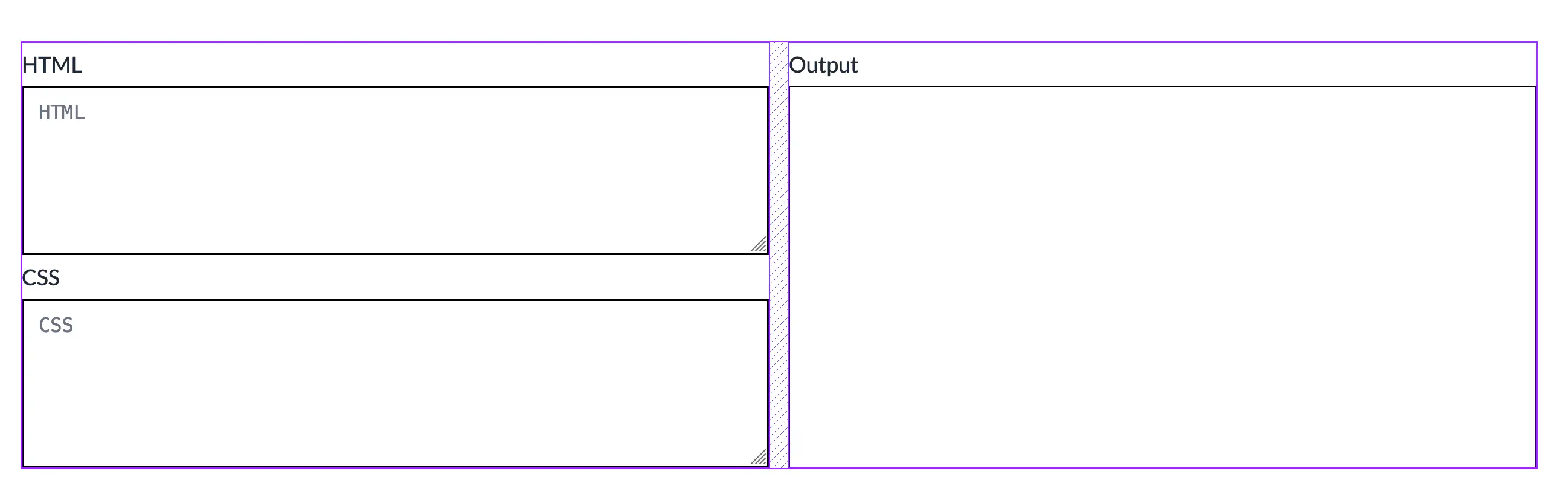
Now we got the aligned code editor!
Sidenote:
If we want to make it more of a flex way, instead of defining height: 100%; to
class frame, we can use flexbox properties instead.
.frame {
    border: 1px black solid;
    flex: 1;
    width: 100%;
}
This is a shorthand for flex: 1 1 0% (Flex-grow, flex-shrink, flex-basis).
It tells that flex item to grow as it needs. When applying only 1 value (in the example above, we only applied flex-grow), the rest of the values are set to their default values.